Matillion Design System
The Matillion Design System is a foundational toolkit for creating consistent, scalable, and high-quality interfaces across all Matillion products.
My contribution
My role involved contributing to the development, maintenance, and documentation of this system, helping to ensure it met the growing needs of the team and the product.
Before I started Design was fragmented with development, handovers were difficult as components were being redesigned all the time, there was not a one source of truth for everyone to pull from.
The task
was to refactor the whole design system. This required rebuilding all the components (as actual components, not just designs), releasing documentation for all components and implementing processes for design and development syncing.
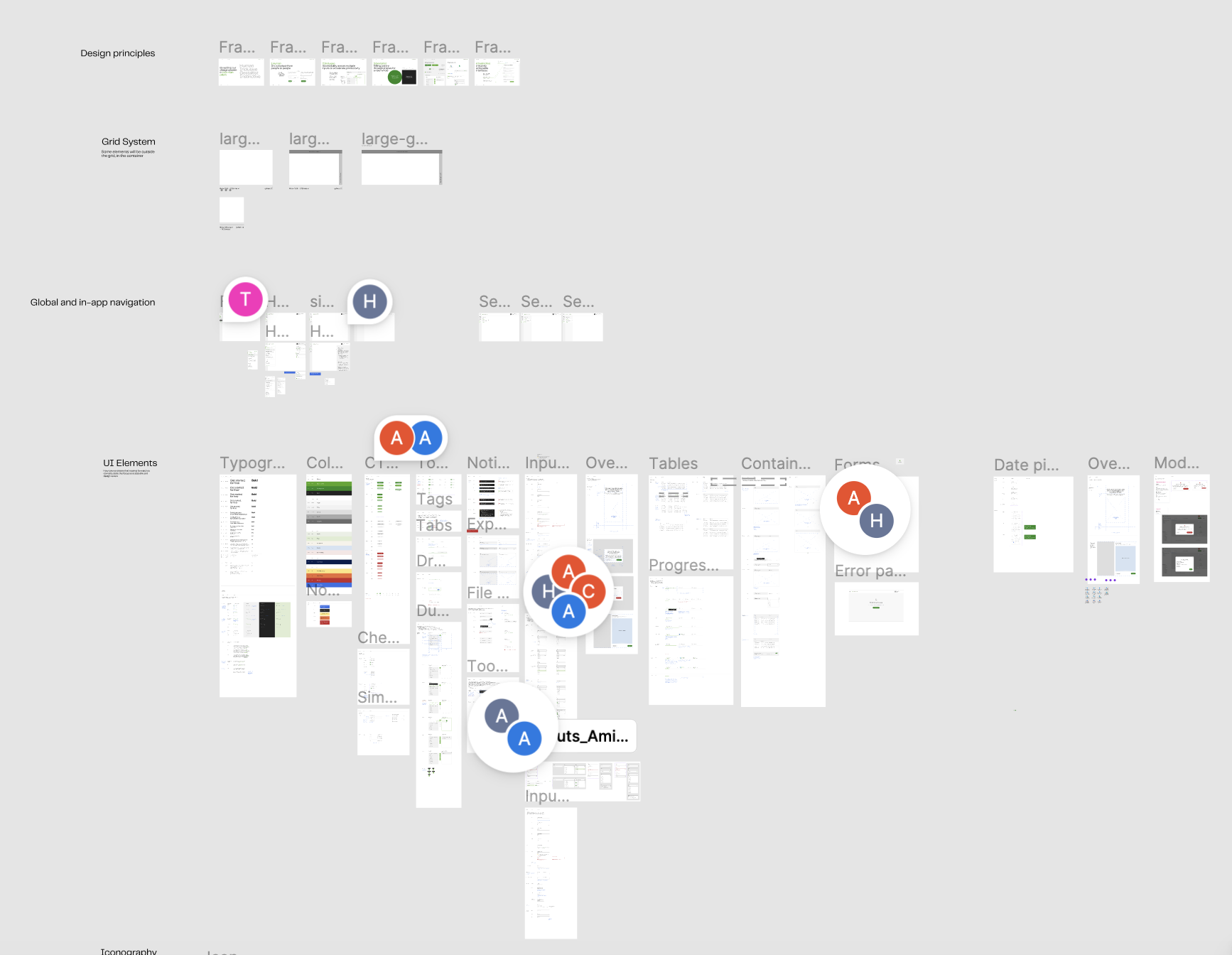
There were no real components and the Design System UI kit looked like this…
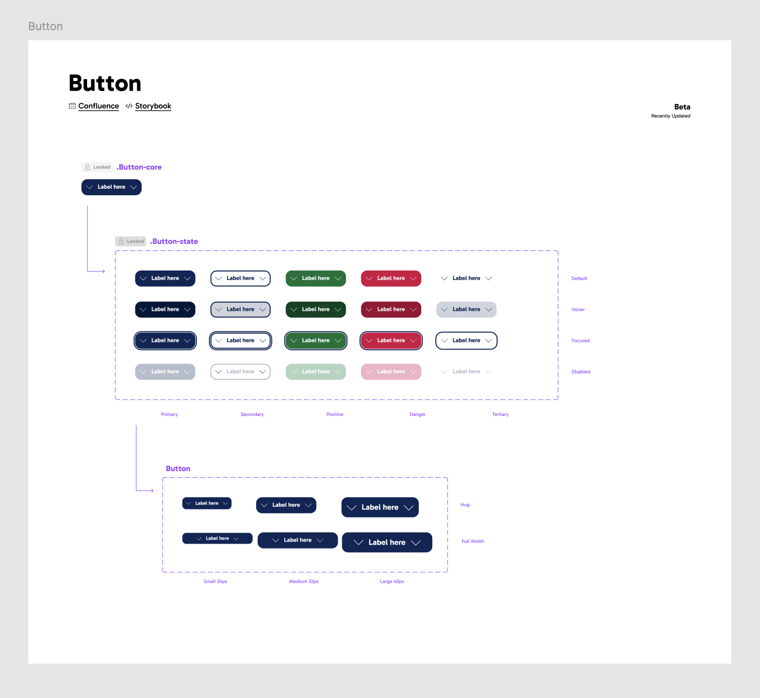
Using nested instances and variable properties allowed us to create a set of highly configurable and sustainable components for everyone to use.
I started by building and creating variables for the basic foundations. Type variables, colour, sizings, baseline grids.
Then used these foundations to start building up small components, buttons, lists items, inputs.
Those smaller components then made up large components, forms, modals, wizards.
I created documentation and guidance for all components, including uses cases and how to use them. This is a self serve open to all designer, development and management. Since its implementation efficiency in the design team has improved by 30%
Included info in the guidances:
Main use cases including do’s and don’ts
Anatomy - including all sizings and available elements nested in the components
links to the development Figma UI kit and development code repositories.
Example of Modal guidance


Stand out successes from the first year of design system implementation:
100% of our components in Figma reached our target of AA accessibility standards
As I refactored all the components I put an accessibility plan in place including a checklist which checks off areas of all required accessibility before we handoff to development.
Productivity in the design team went up 30%
Efficiency increased significantly as pre-built components allowed designers to complete tickets faster, reducing design time and accelerating delivery across projects.
Development and design collaboration improved, handoff became easier.
The use of all the new guidance and UI kit gave sources and references to make conversations easier and collaboration more effective and accessible.